
Adrian Frutiger (1928-2015), the Swiss typographer, designed the Univers typeface, which you have seen everywhere but never noticed. Which is how a good typeface should be. The Univers family of 20 fonts, cleverly related by weight, slope and width, is rational, versatile and comprehensive. Frutiger abandoned the conventional desciptions of “bold”, “condensed” and “italic”, and numbered the typfaces on a grid sytem. Univers 55 was the standard font for text, 65 the bold version and 56 the italic. Frutiger designed it at the high tide of modernism when decoration was taboo. It was a typeface for every need. You didn’t need fancy fonts. There were superb books, brochures, posters and catalogues set entirely in Univers.

City of Westminster street plaques designed by Misha Black using a condensed Univers font with letter spacing in the name.

It was produced by the Deberny and Peignot foundry in 1957 and licensed by the Monotype Corporation. It’s hard to imagine now that such a modern typeface was made to be cast, but it was the first to be designed for both hot metal and film production.

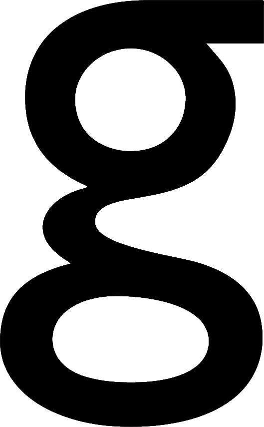
It was a designer’s font. I’d be annoyed when I specified Univers and the printer did the job in Gill Sans. Gill was an eccentric typeface: it was really a Roman typeface without serifs rather than a true sans-serif (look at that lower case g like a pair of spectacles). But Gill is more suitable for post-modern typesetting and (apart from City of Westminster street signs) we don’t see Univers much now. Ariel, the standard, bland typeface for screens, has pretty well replaced it.

What was the rational behind the use of the number ’55’ to describe a normal weight?
LikeLike
That question never occurred to me. Now you have made me wonder!
LikeLike